Article
Website real estate
Your website is valuable real estate. Every pixel can either guide the visitor toward their goal or distract them from it. Widgets, overlays and pop ups can be powerful tools – but only if they are used with care. This article explores how to design visitor interactions that feel natural, respectful and effective.

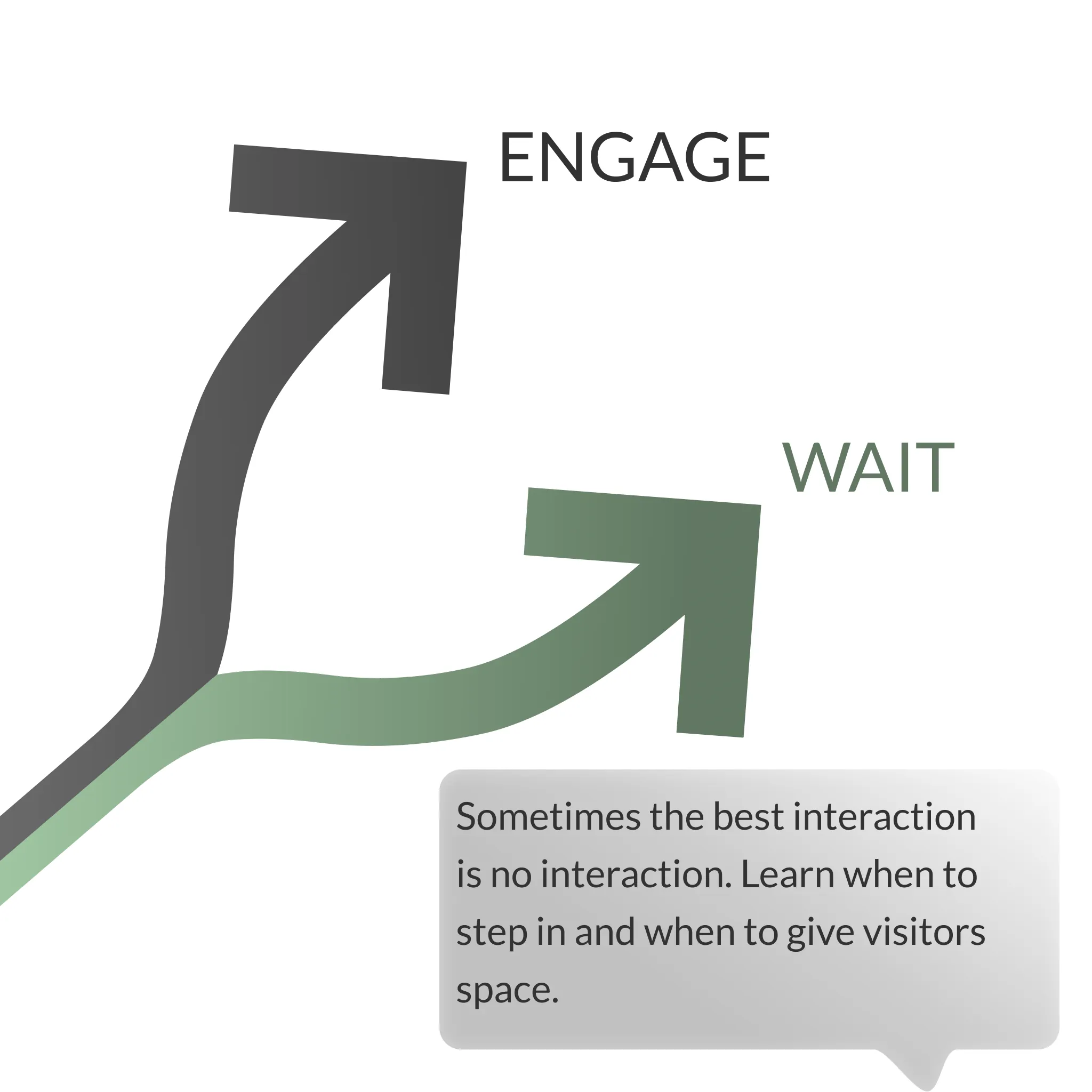
Should we interact with the visitor?
Not every visitor needs an interaction. Sometimes the best approach is to let them browse freely. At other times, missing the opportunity to engage could mean losing a conversion.
The challenge is to balance intervention with respect. Good interactions should feel supportive, never pushy.
The trick is to identify when you create a lift in conversions. But focusing everything on the front-page is rarely a good idea!
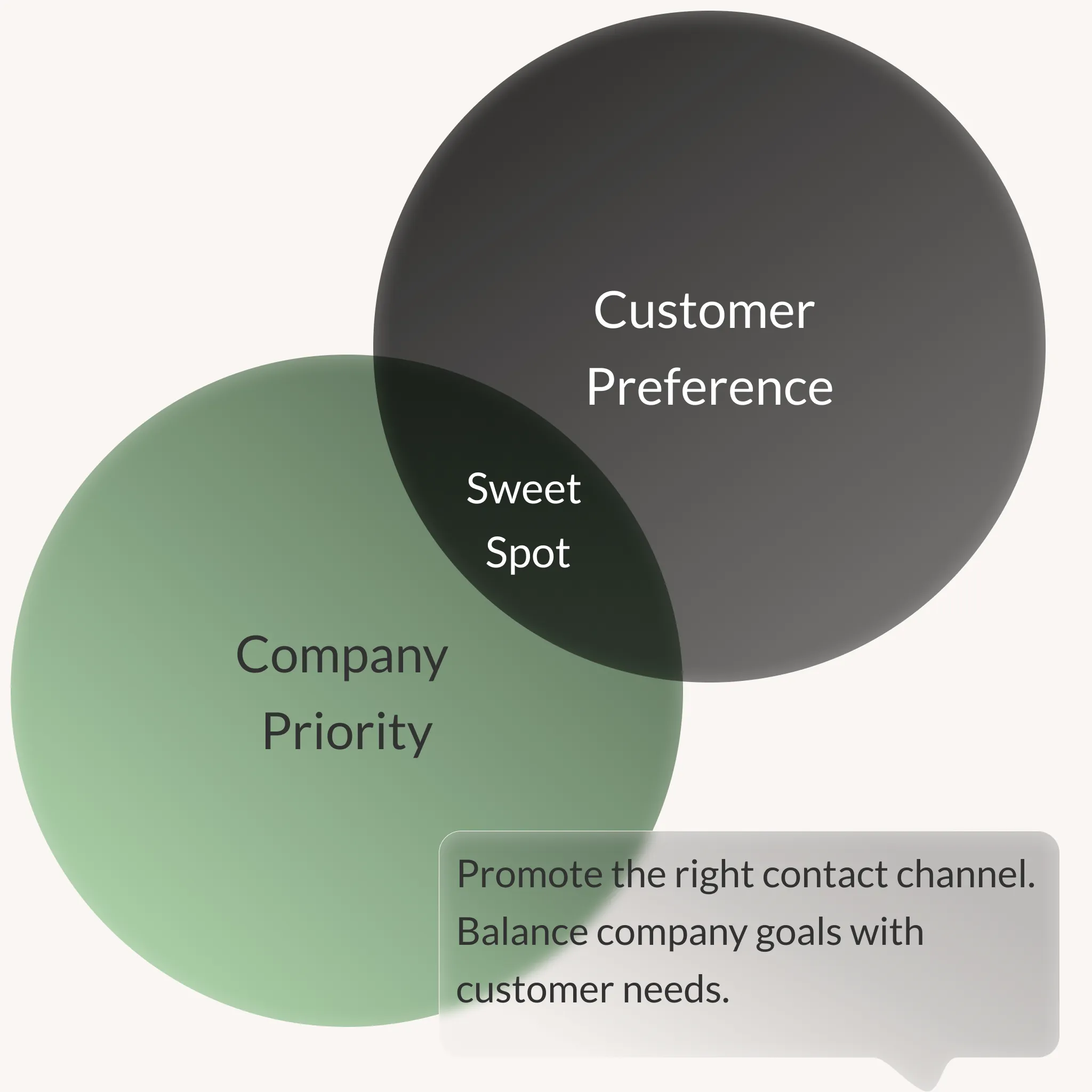
Choosing the right channel
Your contact strategy decides which channel to highlight.
- For e-commerce sites the focus is often on promotions or upsell opportunities.
- For service companies, chats or chatbots usually work best.
- For sales driven organisations, offering multiple contact options can be a smart safety net.
The right choice is the one that aligns business priorities with what customers actually prefer. And what customers prefer is actually key. Don’t force a channel they don’t want to use. Remember to measure both volume, conversion rate and cost for each channel.
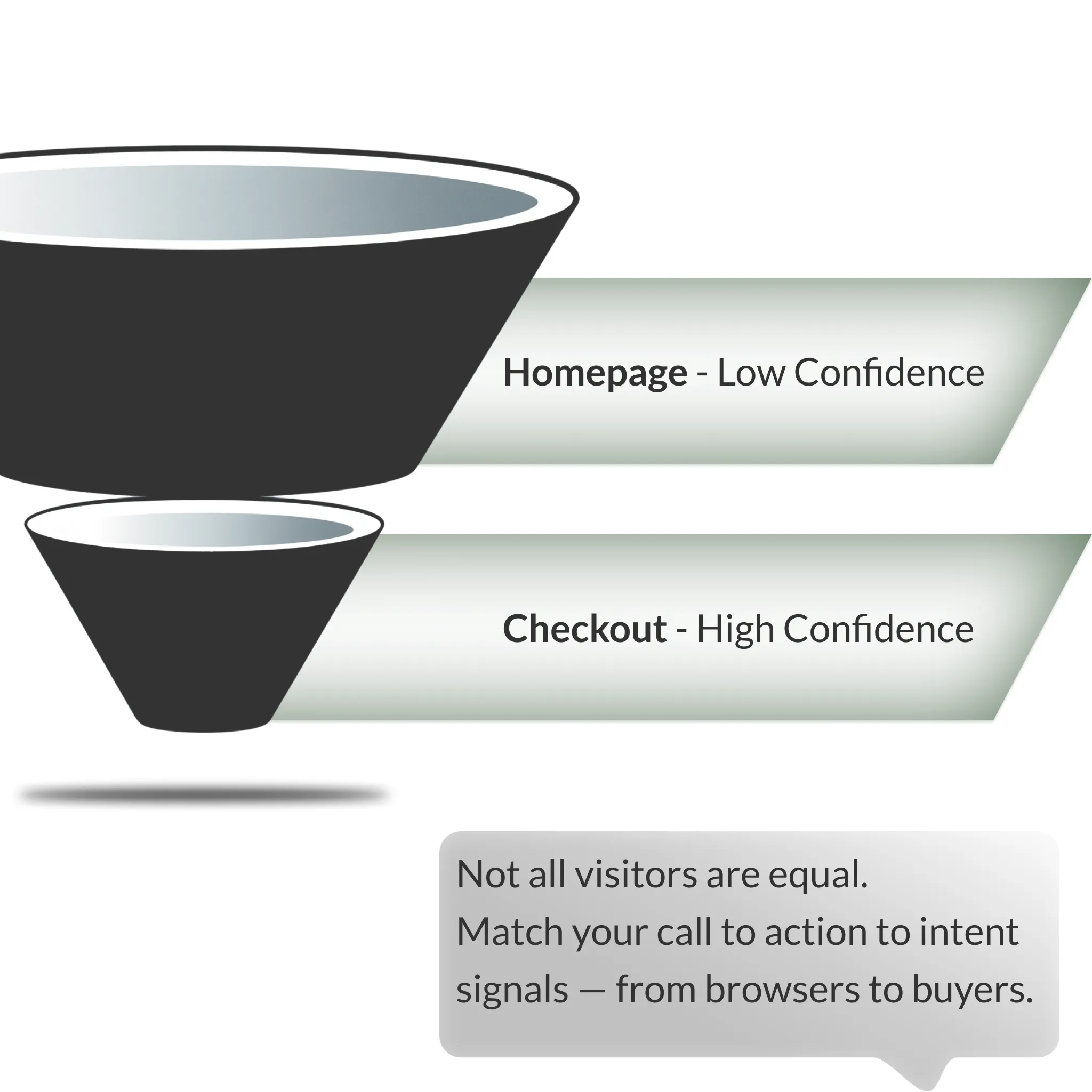
Confidence of intent
The more confident you are about a visitor’s intent, the more direct you can be in your interaction.
- A visitor on the homepage has unclear intent, so broad and qualifying options work best.
- A visitor moving through the checkout process shows clear buying signals, so a focused call to action makes sense.
- A logged in user is almost certainly already a customer, which makes upsell offers relevant.
What data signals you use will increase confidence in intent and depends on the maturity of your tech-stack. Basic signals like website browsing behaviour can get you far, marketing sources further, and specific visitor information from CDP’s furthest. However, if you don’t start out with the basic segmentation, you won’t be able to extract value from the advanced tech-stack.
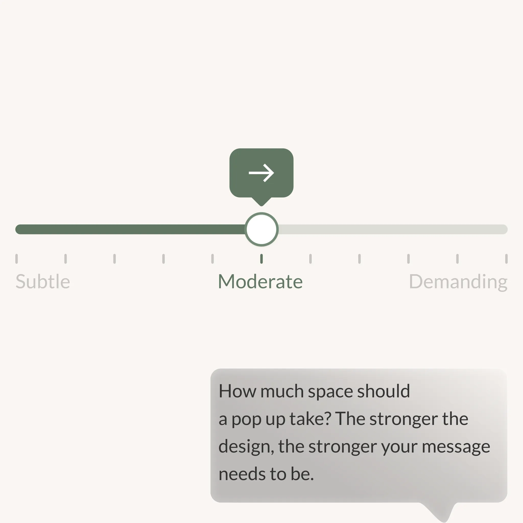
How aggressive should you be?
Aggressiveness sits on a spectrum.
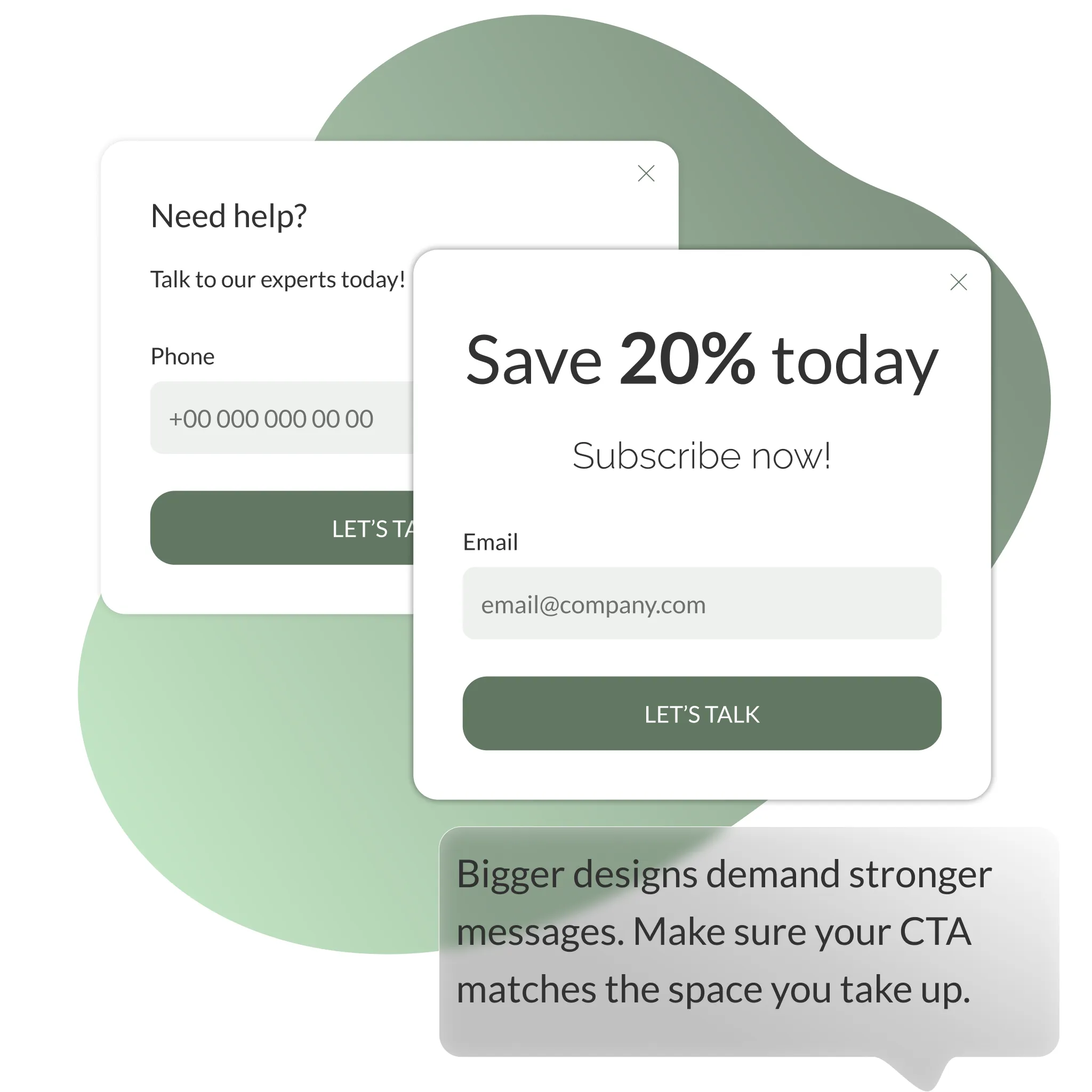
- Minimal designs include small icons or subtle banners that use less than 15% of the screen.
- Moderate designs include slide ins or larger banners.
- Maximum designs take the form of full overlays that demand attention.
The more aggressive the design, the stronger the message and the more confident you need to be in the offer.
Crafting the right message
Messaging is what convinces a visitor to interact.
- A small widget can get away with a soft message.
- A full screen overlay requires a confident and relevant call to action.
Decide if you want to highlight an offer, a competition or a promise of speed such as “Talk to us in under one minute.”
What information do you ask for?
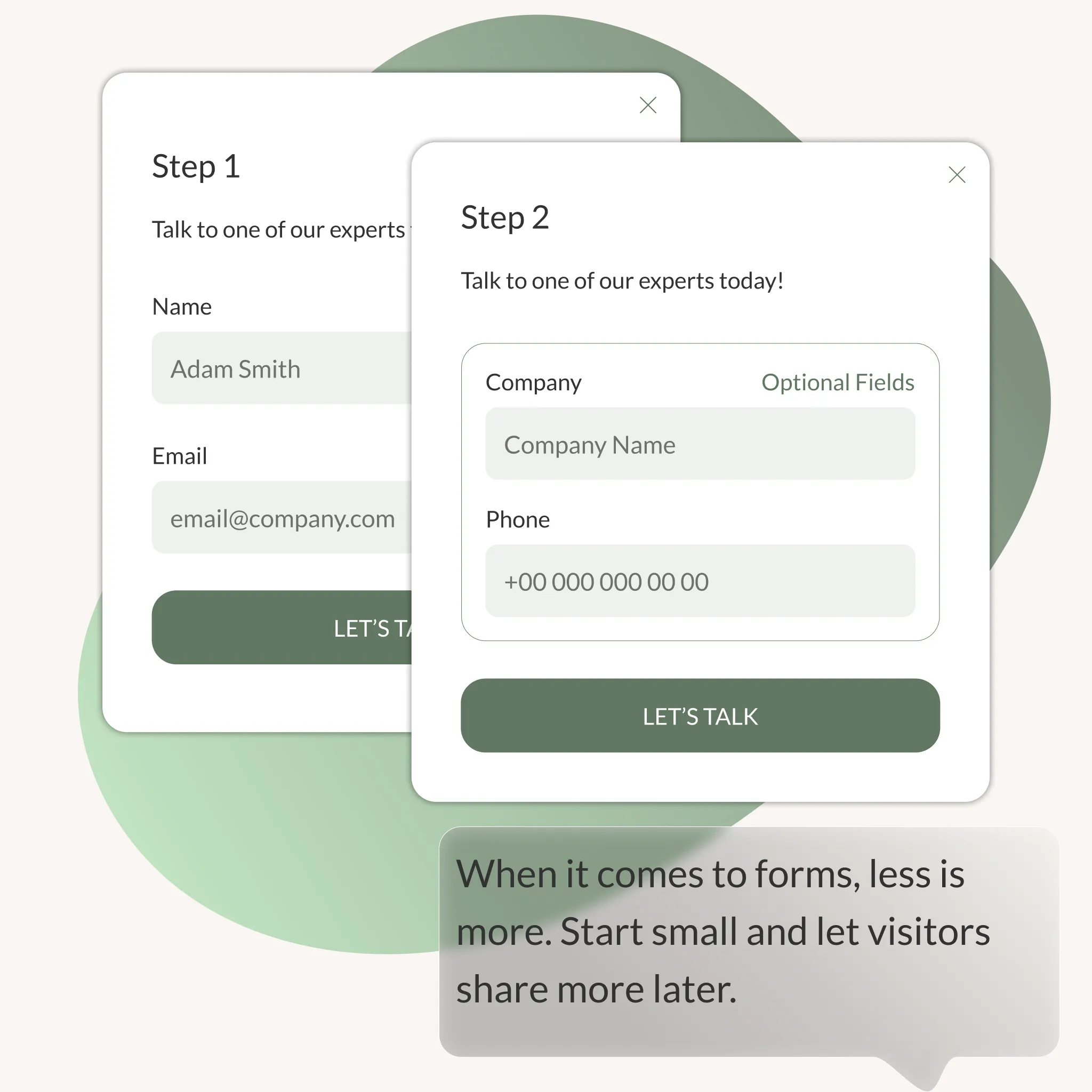
Forms are a part of many interactions. But the more fields you include, the fewer people will finish. Start with the essentials. Ask for more details later or make them optional
Respecting privacy
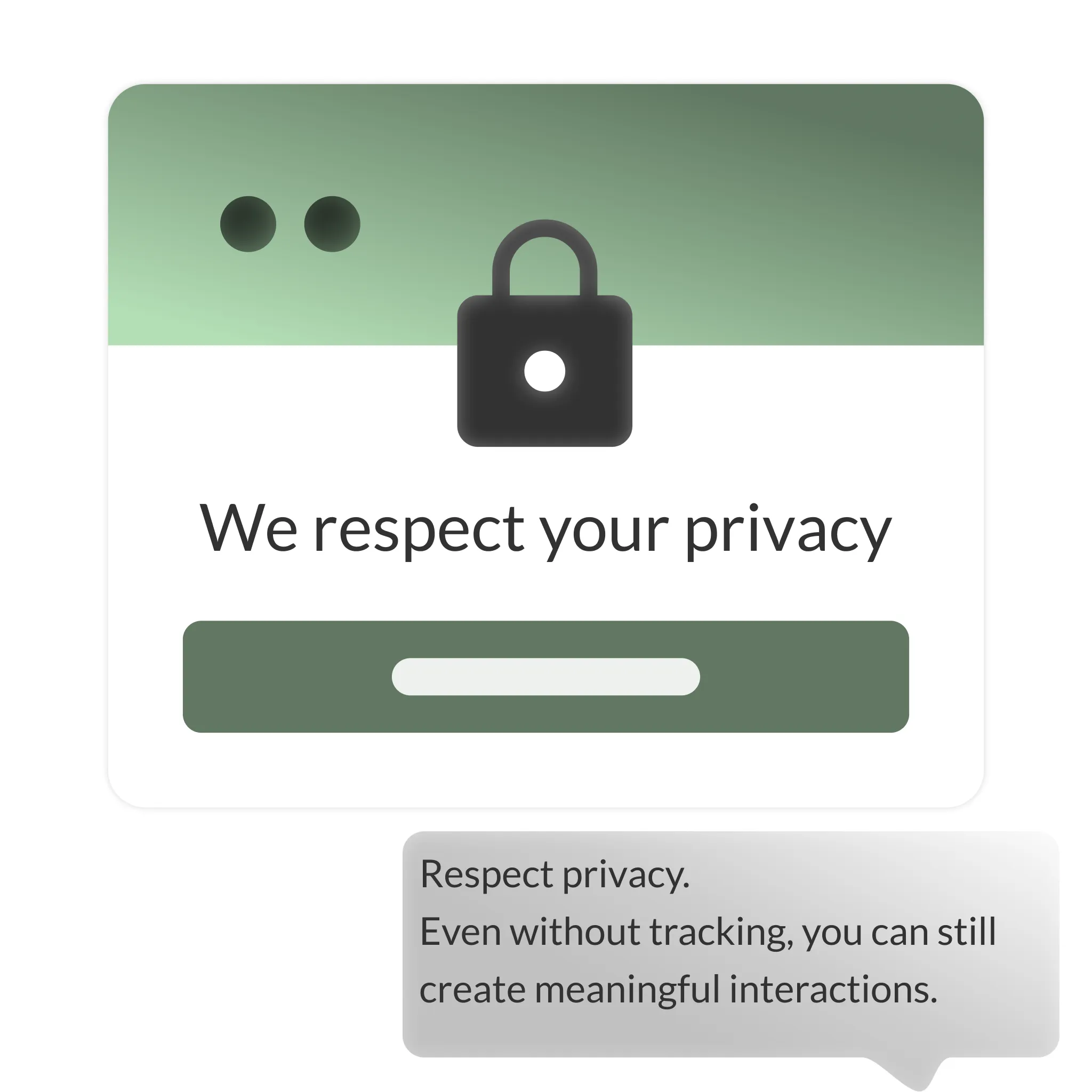
Visitors who don’t allow tracking can still be engaged. You just can’t use data driven targeting. Simple, privacy friendly interactions are better than none at all.
Test and validate changes
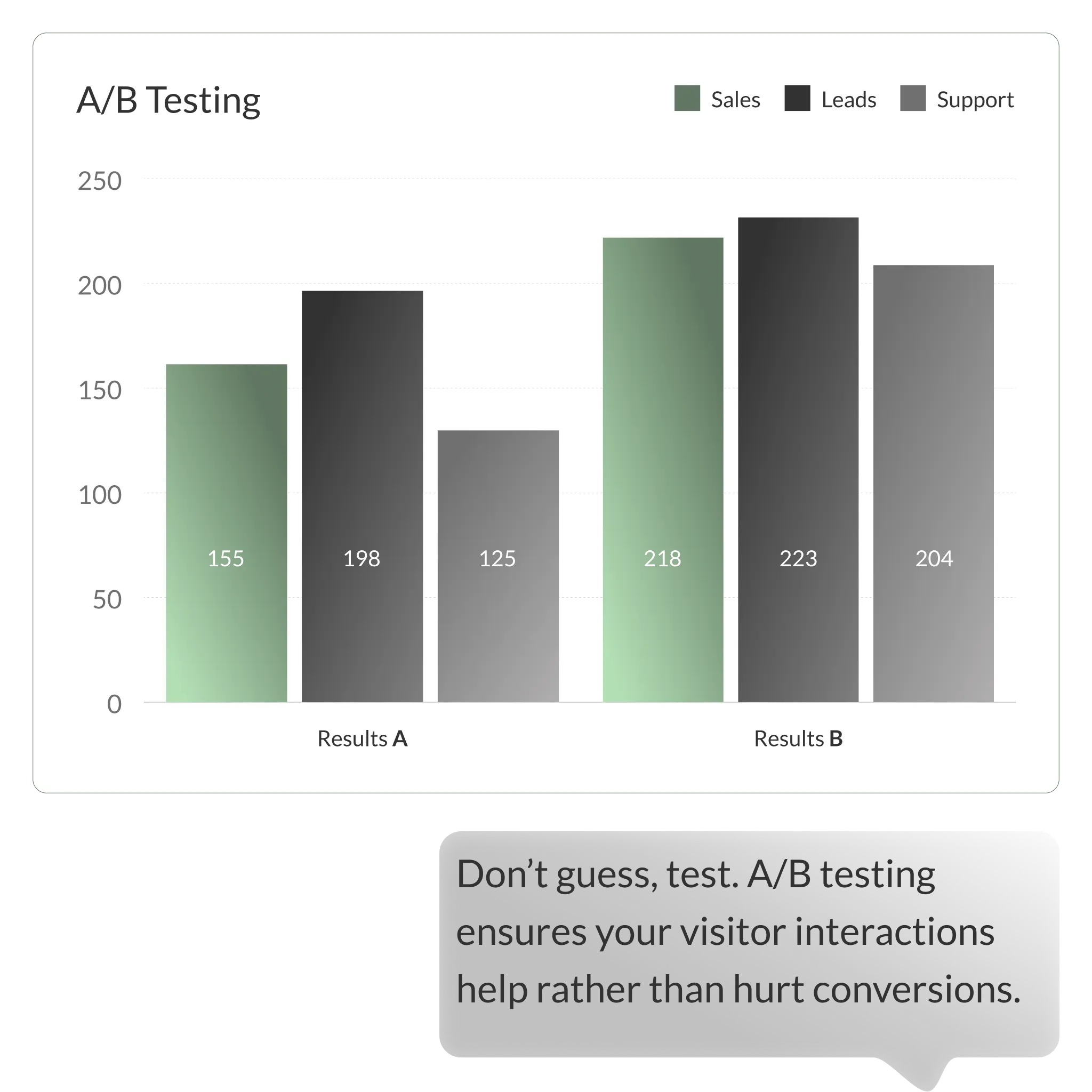
Every new widget or pop up should be tested. Use split testing to see what actually improves performance. Look beyond clicks – include sales, leads and support interactions in your results.
Wrapping Up
Your website is valuable real estate. The way you use widgets, overlays and pop ups can either improve the visitor journey or disrupt it. By choosing the right channels, respecting intent, balancing design aggressiveness and testing every change, you can create interactions that feel seamless and effective.